First up is the BBC, the public service broadcaster of the United Kingdom but also famous for their entertainment content which is why I used their news page1 instead of their main landing page.
In this article I will be focussing on the front pages of four news providers:
- The BBC, the public service broadcaster of the United Kingdom
- The Guardian, a British newspaper founded 1821
- CNN,
- Fox News
These screenshots were taking in the morning of Sunday 20th December.
The Meat: First look at the front Pages
Staleness of articles
The BBC explicitly marks articles with their
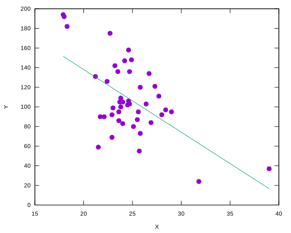
Putting this data through a linear regression (the hammer of data analysis) gives us a correlation coefficient of -0.60 meaning they are negatively correlated and a coefficient of determination—also known as “R squared”—of 0.36, meaning Y explains a decent chunk of X, but not all of it.1

So our conclusion based on this data analysis would be: to improve X, we should be focussing on reducing Y. X represents cycling speed (in km/h) and Y represents power output (in watts), so we are saying that to improve cycling speed, we should be focussing on reducing power output—that isn’t right, at all—in fact, more power means more speed from rudimentary physics. So—how did we end up with this conclusion?
There are no nefarious forces at work: I did not change bikes, applied the brakes beyond crossings or traverse different road surfaces nor did I cherry-pick this workout or synthesized it by combining multiple ones. In fact, I would say you would see the this in a significant number of road bike workouts done outdoors on Strava that have power meter data. We ended up here because we did not take into account confounding variables like the gradient (up/down hills) and wind.
You might think that this a toy example, that this does not happen in real life, or that peer review would catch it, but that is not (always) the case. If you simplify the above data into 3 buckets (flat, uphill, downhill) it becomes an example of Simpson’s paradox “in which a trend appears in several different groups of data but disappears or reverses when these groups are combined” and does sometimes sneak through—see for example this article (the kidney stone treatment example was my first exposure to this phenomenon).
For amateur endurance athletes bad use of statistics can have real consequences when data, from races and/or workouts are incorrectly interpreted and feed into decisions made: but that’s for another time! Be wary next time your mate has “proved” that common sense/physics is wrong by using a linear regression or see a headline that says “X causes cancer” as often it is not simple as that, or in fact, the reverse is true… Statistics, here be dragons.